Thursday 20 May 2010

Information Graphics


The image above is what you would class as 'information graphics' this is because its a poster/leaflet thats informs the reader about how to pitch a ball but uses graphics and diagrams to help show this. This is good because it makes it easier for the viewer to understand the concept of pitching a ball, it also makes it more interesting instead of just reading a page of text there are diagrams that you can look at and help you evaluate what you doing right and wrong. 


This is a chart of informative graphics that shows how much oil we used how much oil where wasting and how long we will have oil for. This is good because its tackling a social issue and showing you the problems we are faced with and what where going to be faced with in 29 years when we run out of oil. This is a very easy piece of information to understand due to the use of diagrams and pie charts and graphics used. 


This is a piece of informative graphics thats about Tsunami's in New Zealand. It shows in a table which areas in New Zealand are at high risk from a Tsunami hitting them and medium risk and a low risk. For each of these areas there is information about how high you should go up (meters) or how far across you should go with the direction (meters). The is also a piece of information graphics in the top corner which shows how far the epicenter is away from New Zealand.  I like this piece of graphic information because it shows clear and important information in a graphics based way, its also very easy to understand and i think it would be hard to explain this in any other way without graphics. 


A piece of informative graphics about if the levels of alcohol changed from 80mg to 50mg per 100ml would it affect how many drinks a driver would have to be over the limit. The piece of information is translated across using graphics and a chart showing how much you would be over or under the limit after 2 hours drinking at 50mg and 80mg, there is one both for man and women all average weight and average height. The charts are easy to understand with the colour coded circles, there is also a key underneath so you can read the graph and understand it. 


This is a informative piece of information about the use of the internet. It uses charts, pie graphs all sorts of different charts and graphs to give out information about the internet. There are a big collection of graphs and charts giving information such as which age groups use the internet most, are desktops or laptops uses more, if men or women use the internet most, all these questions and answered with colour coded graphs and charts i think this is great its gets the information across in a easy way to read.


Thursday 13 May 2010

Semiotics

 Sign: A Image or piece of artwork that describes what its about by the sign/image it gives off

Signifiers: These are the objects inside the image that give the image the description and identity of what the image is about.


Signified: a concept or meaning that is distinguished from the sign through which it is communicated


This is the debut album cover of the American band Manchester Orchestra. The sign you get from this album is that its quite a depressing album, you can see this from the album title "I'm like a virgin losing a child" what signifies this is the young woman not very wealthy woman in a little shack. The really old TV signifies this, also the really old and dated look the album has gives a signified effect about how the album is quite depressing and they are a young new band with not much money.


The sign you can see straight away from looking at this film poster is that its a action thriller film, what signifies is that both the characters are holding guns, the male character is holding two guns that are both pointing towards the viewer, also the bold font used also signifies this. You can see from the poster that the main character is the woman closest, she is the main shot of the posters signifying she is the main character. 


This is the poster for the popular film 'Hot Fuzz' the sign in this film is the the two main characters in the film in police uniform holding a gun. The signifiers in this film posters i that its a comedy film you can see this from the two characters having cocktail sticks in there mouth and the text at the top of the poster that says "They are going to bust your arse" From this you can see that its not a serious film even if the characters are in police uniform. From the scenery behind the characters this is another point that shows that the film isn't as serious as first implied. 


This is the DVD cover for the 2004 film Harold and Kumar go to white castle. This is a stoner film where Harold and kumar get the munchies. You can tell this is a stoner film by the smoke coming out of the burger and the look on both the characters face's also the fact that the film is based around them getting stoned and going to white castle to get food is given away with the being a burger right in the middle of the cover with smoke coming out of it. 


This is the debut album from Canadian post hardcore band Alexisonfire. The sign in this album cover is that is quite a violent fast energetic original post hardcore american album. You can see that is a very american album with the album cover obviously set in an american play ground the voilence is shown with the character closest holding a sharp weapon. You can also see this is the debut album from the band with the album being self titled and no other text on the album cover other than 'Alexisonfire' With the letter 'A' in a scripted font as a shadow on the floor. 

Tuesday 11 May 2010

Advertisement research.


This is a honda Karizma bike advert that used alot of digital animation and work. If you watch the advert you can see that in main parts of the advert a lot of video animations are used. Firstly the use of wind to blow his hat away, then the use of video animation and video editing to show the bike riding underneath a massive wave. This gives a great effect in the video, without the video effects and animations the advert wouldn't work and would be a lot less interesting.


This is a phillips commercial advert for a electric razor they released in 2005. This advert has a lot of surface textures such as skin in it, the advert basically consists of a man shaving his face, this advert show the texture of his skin and how the new phillips razor will protect and help you skin whilst having a shave. If this advert didn't show the texture of the mans skin it wouldn't have as much effect.


This is and advertising campaign that involves scale. The picture is a cross section view of a cigarette. Inside the cigarette is lots of small men and cars and motorbikes charging through it. Its the scale and contrast of the little character and the cigarette that make this photograph.


This is another honda advertisement campaign, this one contain illustration and cartoon like characters. The whole advert consists of cartoon animals in a nature park. This advert obviously consists of animation, so that the characters and objects move about. But The advert is made up of colorful illustrated cartoon characters.


This is a stop smoking campaign poster that is made and put up to get the attention of smokers and to provoke a response out of them, the best response being to get them to stop smoking. The image of the woman standing on the pack of cigarettes with the small message saying how the NHS can help you. This is all to provoke a response out of the public who smoke and with a number to ring and to text to receive free nicotine gum and patches. 


This is a advert for a nature park. Many time throughout this advert the use of a macro lens is used. There are a lot of shots throughout the advert where the camera zooms full up to parts of nature such as lily pads, flowers this is used best with the effect of using the macro camera lens.

Tuesday 4 May 2010

Viral Marketing and Advertising

Viral Marketing and Viral Advertising are marketing techniques that use pre-existing social networks to increase brand awareness and to try boost product sales. Word of mouth and the internet and social networks all help viral advertising work, getting the word around.  Guerrilla marketing is the same slightly it uses unexpected and unconventional campaigns to engage and provoke the viewer to create a buzz.


This is a viral advertisement from ikea. I think this is a really good example of a viral advertisement, i think its a great advert that i find really funny. This works great as a viral advertisement because its a simple yet funny advert, where a old woman gets the better of a business man. This will work really well due to the likes of youtube, social networks and just word of mouth, people will be talking about the advert and asking people if they watched it, then when the question is asked what company is the advert for, and you here ikea thats the viral advertisement working getting people talking about the company.


This is a viral poster that i found on the internet. As you can see from the message at the top of the poster , the poster responds when people look at it. When you look at this poster you see a happy couple together (as you can see in the left side) But when you look away from the poster the image changes to the man hitting the woman. This gives our a very strong message, that you might not be able to see these things happening but they do happen in the everyday world. This poster looks like its at bus stop, everyday thousands and thousands of people use the buses, and would see this poster and with such a strong message and such a clever way of putting the message across it wouldn't be long before word got around about this. 


This is a viral advert made by VW the car manufacture company. This viral advert is filmed from a CCTV camera on the motorway. The advert is a VW car on the side of the motorway on the hard shoulder with a breakdown recovery van behind it. Its the irony in the advert that makes it so good, as a viewer you think the VW has broken down and is going to get towed away but as you see in the advert the VW tow's the recovery van away. Watching this advert on the television you wouldn't no what the advert is about till the end where the VW logo comes up and a slogan saying " If only everything in life was as reliable as a volkswagen. Many adverts that volkswagen make have hidden messages in them or have a ironic side to them.


This is a viral advert for Fifa street 3. This is quite a long viral advert compared to the other one's i have looked at. This advert doesn't consist of much apart from a bunch of skillful people playing football in the street. The people in the advert are really skilled at football and some of the tricks they do really grab the viewer and draw them into the advert, again from just watching the advert on the tele you wouldn't no what the advert is for until the end of the clip. The Advert is for fifa street 3 a football console game that consists of playing a very skillful game of football in the street. Some of the tricks the people do in the advert are beyond what i no i could certainly do. After watching this advert i immediately showed it someone else because how talented and skillful the people where, this is how the viral advert works best from word of mouth, at the end of the video you get a link to a website www.fifastreet3.com that is it, thats the only part in the advert that tells you what the advert is advertising.


This is a viral advert, about AIDS. This again is quite a long viral advert and at first its quite a weird advert and i didn't quite understand what it was about. When first watching the advert i was quite confused about what was going on but the message that is given out once you have watched it is, STI's can be passed around very easily and you should always wear protection.


Tuesday 27 April 2010

Fosters v. Carlsberg

Fosters and Carlsberg to companies that brew beer all over the world. Fosters is a Australian beer than its brewed in many countries, a statement has been made that in Britain, a average of 30 pints of fosters are drunk every second. 
Carlsberg on the other hand is a danish company that was founded in 1847. In 2009 Carlsberg became the 4th largest brewery in the world having around 45,000 employees.


This is the fosters advert that was on the tv in 2007. This advert is great, the first time i watched this i found it quite funny when i realised what the advert is all about. One thing Fosters go on about in the posters and advertisements is how its best when its super chilled. So in this advert there is a guy who wants to get to his mates without his beer getting warm this is going to be hard when you on a hot sunny beach, so he jumps and runs about like he is doing a assault course, ducking and diving to stay in the shade to keep him beer cool. As i said before when i first watched this advert and realised what point they where putting across i found it really funny and it does work. I thought this was a great advert, the end of it where the guy has sat down and starts to drink his beer really makes the viewer want a pint of fosters chilled. This advert works really well.


This is the carlsberg advert that hit the tv screen of the british public in 2006 is probably one of my favorite adverts and if not the best advert for beer. For the last few years now Carlsberg advert have had there slogan "Probably the best beer in the world' In many of there adverts they have used this slogan plus another line about how they would probably be the best at doing other things like dreams and like the advert above about flat mates. This advert Is about a young guy who goes looking for a flat, he knocks on one of the flats he's circled in the paper and goes to look around it. This is the best bit about the advert, showing the guy around the house with all this new technology what carlsberg have created , and when watching this advert your thinking "i would love to live in this house" the house is full of things a football would love and enjoy. At the end all the flatmates are stood on the balcony of the flat watching football match, this is where Carlsberg famous slogan comes in "Carlsberg if we made flat mates we'd probably make the best flat mates in the world"


Both of these adverts are great i think the fosters one is funny and the carlsberg one is a dream situation, There is nothing wrong with the Fosters advert but i prefer the Carlsberg advert this is because of how there advert is well crafted and the way they used there slogans.

Coke v. Pepsi

Coke and Pepsi are two of the if not the biggest drink companies in the world. It was Probably coke who broke onto the scene first with coca cola claiming that there products are sold in over 200 counties and has been a register trademark in the United States since March 27 1944. Even tho Pepsi has been around longer and has been a registered trademark for longer it never made as much impact as coke did. Both companies have made variations of there original product, that have been released in certain countries for limited amounts of time.


This is the coke advert that aired a few years ago its based on the popular game gta. After never seeing this advert before until today, i actually really like it. The advert is obviously aimed at people who play the console game Grand Theft auto. This is a very big age range of people going from the teenagers to parents. This is a very wide target audience meaning that alot of people will watch the advert when it comes on. The advert is great, the start of it is typical Grand theft Auto scene, car racing round the streets, parks up anywhere storms in the shop, then it changes, the character then grabs a bottle of coke and slams the money on the counter. The advert still stays in the gta style game, but different instead of violence and road rage, the character turns into a hero, helping everything around him, the advert give off a great vibe towards the end about why you should drink coke.


Pepsi adverts are very different to coke adverts, most of coke adverts are based on different things and different scenarios, where as Pepsi adverts alot of the time are based around football. This advert above is when David Beckham was sponsored by them. This advert is quite funny if I'm being honest, Beckham gets sent off in a Manchester untied game against Juventus, Whilst walking down the tunnel for a early bath, he bumps into a kid who gives him some pepsi, then asks for his shirt to wipe the top of the can for after he's used it. This irony of the little kid being a juventus supporter and Beckham thinging he wanted his shirt and was a supporter when he was really supporting the other team.
This advert is a lot shorter that the  coke advert and is quite funny. The coke advert has a funny side to and and is a very good advert and you can see that it really worked, i also prefer coke to Pepsi but if i'm being onhest i prefer Pepsi adverts this may be because i enjoy watching football but i find there adverts ironic and funny and in this case i prefer the Pepsi advert to the coke advert.

Tuesday 20 April 2010

Contrasting Companies

Relentless and Rockstar Energy drinks.
My perception of Relentless is that its the biggest branded energy you can buy apart from red bull, but thats expensive and if I'm being truthful not worth the money. and it has its own unique taste. A lot of what relentless are about comes out on the design on the cans. With the top half of man drawn out across the can with there usual slogan "No half measures" Where are rockstar isn't as big as relentless but just as good, Its also slightly cheeper and i personally think its a nicer taste. The design on rockstar cans is lot less simple its basically a star on the side of a can with two R's inside it.
Below is a Relentless advert.

And this is the rockstar advert.

The products don't differ that much, both companies sell the same flavours and the taste doesn't differ that much. The adverts on the other hand are different tho. The relentless advert is a lot longer than the rockstar advert. The Start of the relentless advert is very quite and has morbid feel to it, the advert goes through scene's of a skater and free runner failing and not being able to go about his work. Then the advert changes to where everything goes to plan the skater is skating well and the free runner isnt falling then at the end of the advert the word "relentless" comes up with there slogan "no half measures" After watching the advert you then see what point the advert is putting across that relentless will help you through your day and help you succeed with no half measures.
The rockstar advert is much different for starters its a lot smaller and and is set it a totally different scene the relentless one looks like its been filmed in london where as the the rockstar advert looks like its been filmed in a desert somewhere hot like america. The rockstar advert also has a attractive young lady in who stops at the side of the road because her car has over heated, she then goes and gets a chilled cold can of rockstar, then the metaphor comes in now, from the road behind a man with a guitar (a rockstar) walks down and stops in front of the car and plays a guitar solo. The advert then goes to a clip of a rockstar can with the words "Rockstar gets you going" then the car women drives off. This is a much shorter advert and more humorous the relentless advert has a serious feel to it.
I probably prefer the rockstar advert because its shorter and has a funny side to it, i find the relentless advert to long and to serious.

Thursday 15 April 2010

Anti smoking campaign


This is a advertising campaign against stopping smoking, the video show a women smoking a cigarette and shows the smoke traveling through her body. It then goes to a scene where someone cuts open a humans lung and pours tar in it, this is to show how the smoke condenses into tar in the lungs. The visual content of the video is disgusting, firstly showing the smoke travel through the body to lungs, then showing how the smoke condenses to tar in the lungs, this is quite a disgusting scene in the video and for someone who smokes it has quite a depressing feel to it. For somebody who smokes and watches the video it makes you think about what your putting your body through and lungs through. The video communicates to you and gives the message to people who smoke how dangerous it is and how its seriously harming your body, it does this by showing you disturbing scene's. The is real sound or music in the video, i think this is because if the was audio in the video it wouldn't have as much of are dark and depressing effect to the video.


This is a stop smoking poster. This poster has a very blunt message and gets it across well. The poster has a fishing rod hooked around a woman's mouth and a message that says "The average smoker needs over five thousand cigarettes a year" The poster is saying a lot of things, one thing is how easy its to get hooked and addicted to smoking, how much people smoke in a year and how costly it is. The image in the poster isn't very nice, having a fishing rod hooked through a woman's mouth, this is probably to scare people who smoke and see the poster because its not a nice image. Below the fact about how much people smoke it says "get unhooked" with a number and a website you can contact to help you quit smoking, this is a basic poster that gets the message across and gets you thinking. 

Obesity campaign

Michelle Obama has started a campaign to reduce obesity in america. Her aim is to reshape kids of america, by  changing what they eat in the school pack lunches and introducing more physical exercise. Her goal is to eliminate child obesity within a generation. One key point she makes when announcing the initiative to an audience of Cabinet secretaries, lawmakers, educators, medical professionals and school children in the State Dining Room of the White House is "This isn’t like putting a man on the moon or inventing the Internet. It doesn’t take a stroke of genius or a feat of technology. We have everything we need right now to help our kids lead healthy lives." The campaign that she has start is called 'lets move' Below is a short video about the campaign. 


This video campaign is about Michelle Obama saying how she and her family where just a general family before they moved to the white house and how she realised that her family where becoming un healthy and changes had to be made. The campaign makes you feel and think about how healthy you are and how you could change your lifestyle to become more healthy and stop eating as much junk food. The campaign communicates with you with michelle realised obama saying how they where just a normal family and how she that she needed to make changes for her and her family just small little changes what make a big difference. Also throughout the video all the activities that she mentions and the ways to eat more healthily are portrayed in a fun and exciting way making people feel that eating healthily and exercising can be fun and exciting. The visuals used in the campaigns are images and clips of children eating healthy school lunches and exercising but doing all this whilst having fun. The the music throughout the campaign is quite slow giving it a more deep down to earth feel to the campaign making you think.

Tuesday 13 April 2010

Drink driving campaign


This video is a advertising campaign that aired in the UK in 2008. The campaign is to get the point across about how dangerous and how serious drink driving can be. From watching the video you can see that peer pressure is involved and its his friends who persuade him into having another drink putting him over the speed limit. The campaign uses a example of running over a attractive young female that the man had met in the bar earlier. The video content makes you feel quite bad, it makes you think about what could happen if you where to drink over the limit and what the consequences are, the advert works really well because nobody wants to be in the situation that the video gives out. The visuals and sounds in the video really give a scary effect and makes you think about it. The visuals are great in this advert they give the effect that the table is the car and the sounds of the car hitting a pedestrian are given off when the tables hits the lady and throws her across the room. The final shot of the video is the women lying on the floor like if she had been hit by the car lying on the side of the road.


This is another Campaign advert that aired in 2009 on tv's around the UK. This advert runs through all the possible outcomes that can happen if your caught drink driving. The main person in the advert changes his character throughout the advert to 4 or 5 different people to show the outcomes of drink driving for example losing your license, losing your job, not having any money. This is a campaign to make you think about what the consequences are of drinking driving before you put yourself in that situation. The character communicates to you as if your the person who has committed the offense, this could be to almost scare you and make you think before you have another drink and put yourself over the limit because nobody wants to lose there job and have no money due to one extra drink. This campaigns is most affective due to the different sounds the character uses in his voice to act out different people to show the different outcomes and all the different things you can lose to drink driving. You could even lose you life.


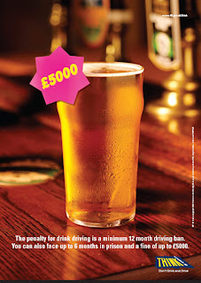
This is a drink driving poster that outlines the consequences of drink driving and how much that one pint can cost you if you get caught and get a fine. A simple poster that gives out a strong message.